I always get asked what paint colors I’ve used so far in my house! With so many different rooms/nooks, I’ve had fun experimenting with colors and different wall textures. I wanted all the rooms to flow but still be unique on their own. I recommend buying a few different color sample sizes and testing on the wall before you begin painting, then you can see how the color looks at different times during the day! Below, I’m sharing an up to date breakdown of all the different paint colors. I’m not sure which one is my favorite but each one is special to me!
The Office
SHERWIN WILLIAMS RENWICK OLIVE
I knew this small room off the living room would be the perfect space where I can edit, upload and chat with you. To me an office needs to feel comfortable, inspiring and motivating, which is why I went with a more moody olive green color.
The Kitchen
BENJAMIN MOORE VAN BUREN BROWN ON CABINETS
Brown has been my obsession over the past year or so and I have a feeling that it’s not going anywhere any time soon! I painted my kitchen cabinets brown, and I was worried it might make the room feel dark and heavy, but that isn’t the case at all. It grounds the kitchen, and let’s all the other elements shine!
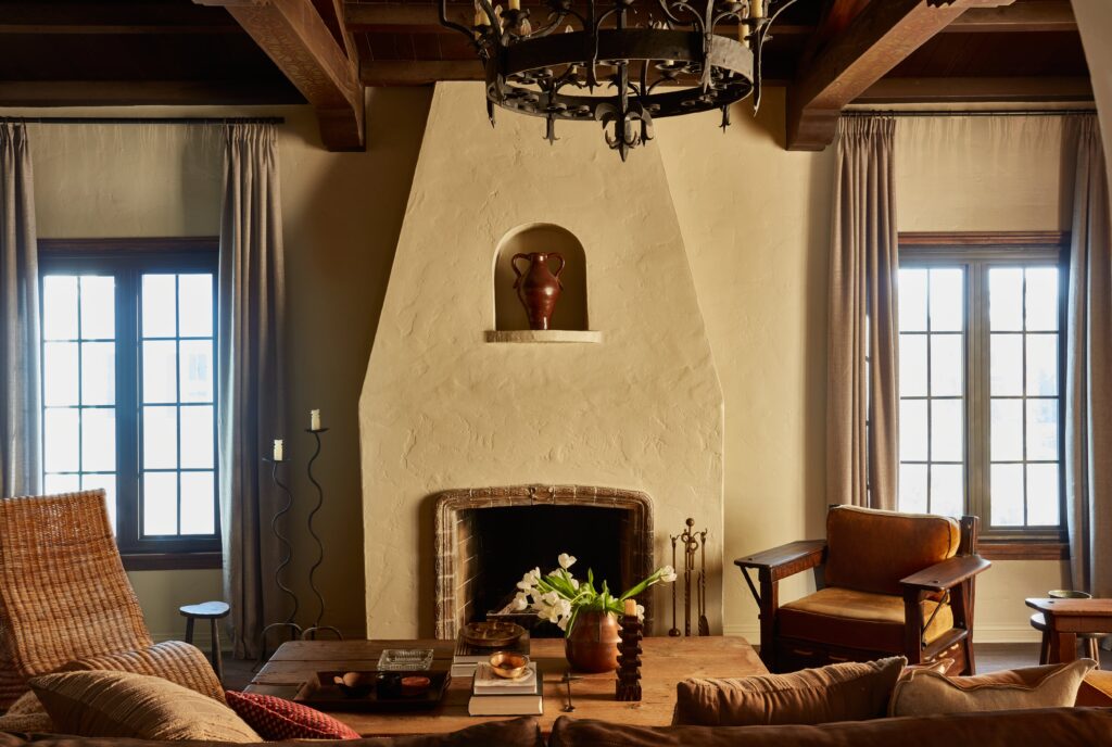
The Living Room
FARROW & BALL OLD WHITE
My living room feels like one big hug! I wanted to keep the paint color more simple and opted for a soft grey green. The room is filled with many collected finds including my favorite vintage stained glass doors.
The Breakfast Nook
FARROW & BALL DIMITY ON WALLS & OXFORD STONE ON TRIM
I wanted to keep the breakfast nook super bright and airy, so I used a very pale taupe. The only demo I did in this small room was removing the existing tile and laying new paver-style travertine tile; it was the perfect addition to this space.
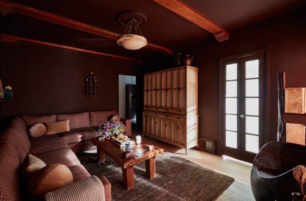
The Movie Room
SHERWIN WILLIAMS ROJO MARRON
When I decided to create a movie room, I wanted to do a dark color since the room would mostly be used at night for movies/TV watching. I loved the idea of doing a dark red and how it coordinated back to the couch. I really wanted to make this space feel like a “fox den”.
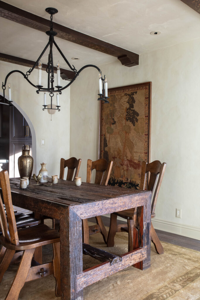
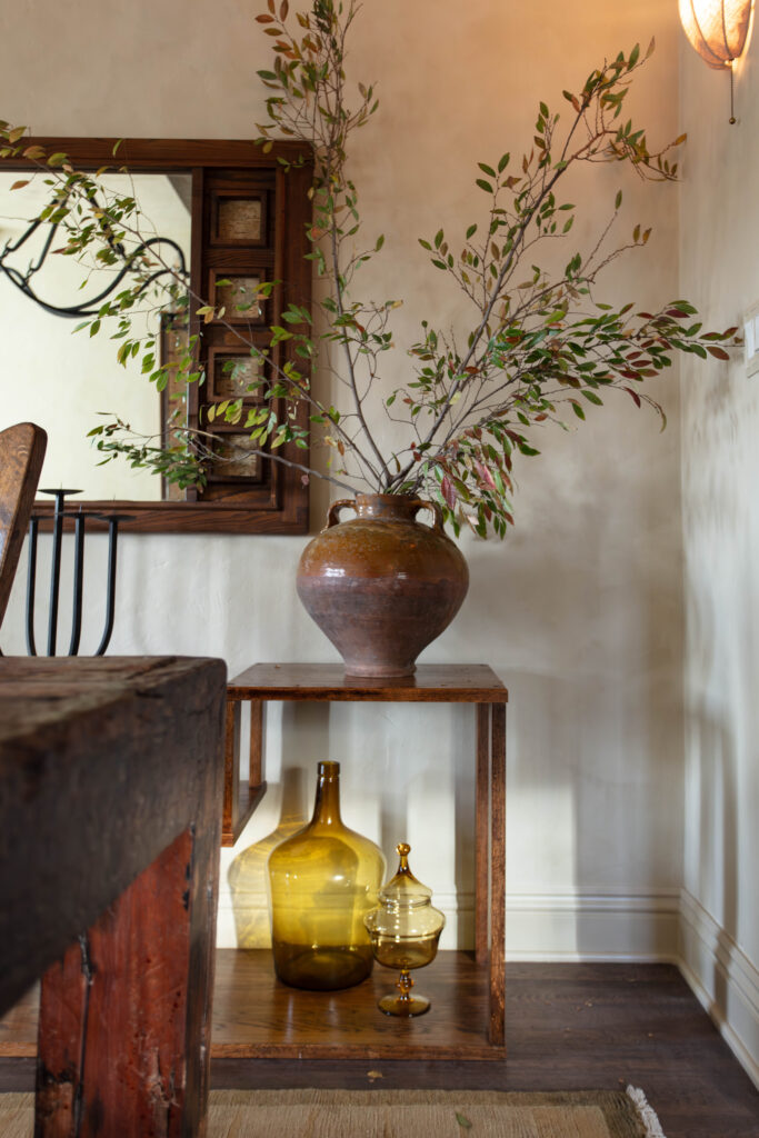
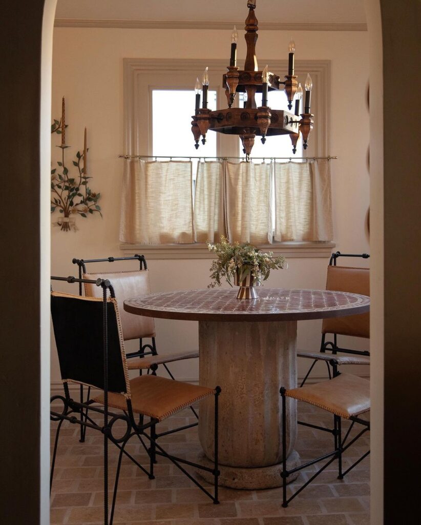
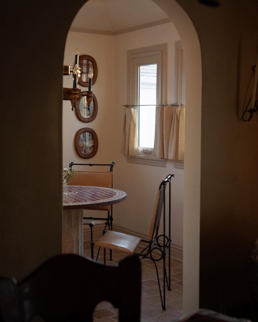
The Dining Room
PORTOLA LIMEWASH BISTROT
My absolute favorite project to date was restoring and adding life back to my 1929 Spanish dining room! After opening the large arch and converting the cabinetry behind to a coffee bar, the design of the dining room came together quite quickly with 98% collected finds. I used a limewash paint to give some movement with this golden moss color.
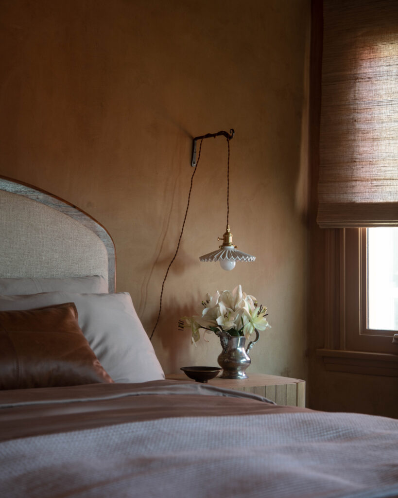
MARIE’S BEDROOM
MEODED MARMORINO PALLADINO IN WARM SUEDE
Marie has always loved a darker/moody room (her previous was a dark grey limewash) and I decided to go with a color a bit moody once again. These walls were definitely a bit labor intensive but I have to say the results are stunning. I’ve always wanted to work with a wall finish like this and it’s the perfect backdrop for the rest of the room.
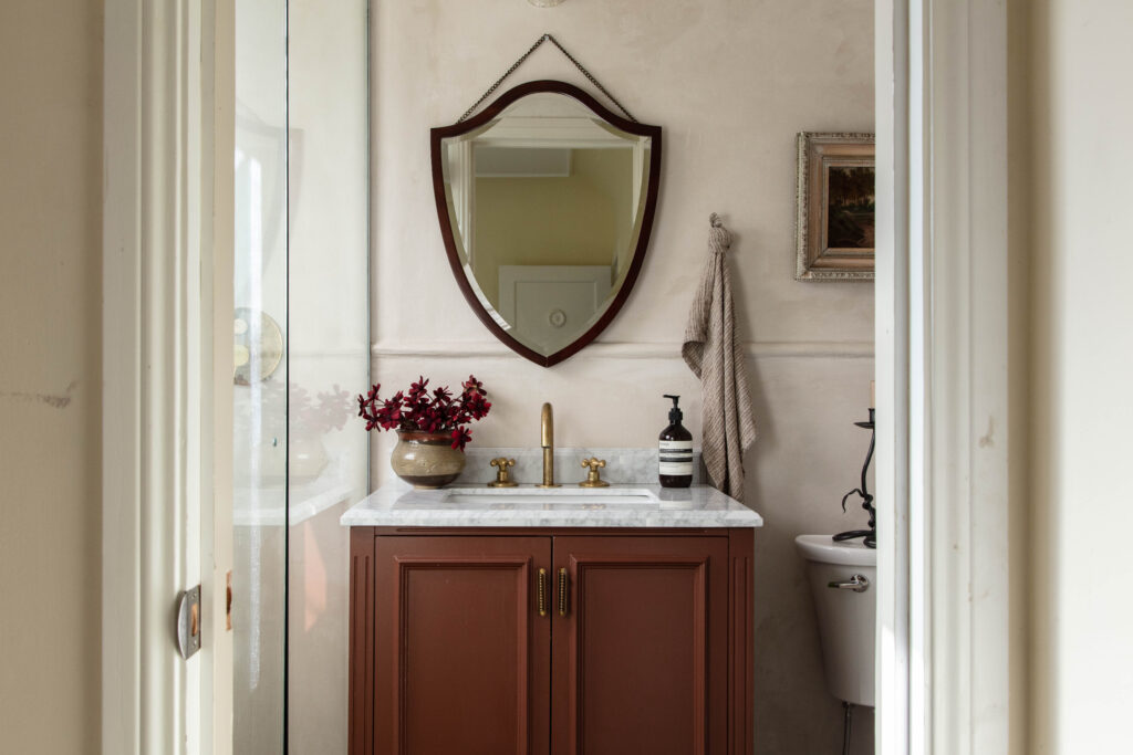
The Bathroom
MEODED CONCRETTA IN WESTWOOD BEIGE ON WALLS & SHERWIN WILLIAMS AURORA BROWN ON VANITY
After finding out about a product called Concretta from Meoded, I knew I had to give this a try in Marie’s small bathroom. My goal was to bring back that historic charm and the color fit the space perfectly! It created a very calming and relaxing vibe.
Choosing paint colors for my home has been a fun adventure! I’ve enjoyed trying out different shades and textures to create a cohesive yet unique look for each room!

")
